Studies in the Principles of Animation
Studies in the Principles of Animation is a student exhibit based on work created for ARTM 3103 - Animation. Students learned the principles of animation and how to apply them to different design assignments, such as logo animation, character animation, and text animation. See below for more information and examples of their work.
A new jargon was heard around the studio, Words like ... "overlapping" and "pose to pose" ... gradually had been isolated and named. Verbs turned into nouns overnight, as, for example, when the suggestion, "Why don't you stretch him out more?" became "Get more stretch on him...." The animators continued to search for better methods of relating drawings to each other and had found a few ways that seemed to produce a predictable result.... As each of these processes acquired a name, it was analyzed and perfected and talked about, and when new artists joined the staff they were taught these practices as if they were the rules of the trade. To everyone's surprise, they became the fundamental principles of animation:
1. Squash and Stretch
2. Anticipation
3. Staging
4. Straight Ahead Action and Pose to Pose
5. Follow Through and Overlapping Action
6. Slow In and Slow Out
7. Arcs
8. Secondary Action
9. Timing
10. Exaggeration
11. Solid Drawing
12. Appeal
Thomas, Frank, and Ollie Johnston. Disney Animation: The Illusion of Life. Abbeville Press, 1981, p. 47.
While the Principles of Animation were codified in Walt Disney's studios during the Golden Age of Animation (late 1920s to early 1960s), these concepts are still integral to all moving graphics. Look at any screen, and you are bound to find the Principles of Animation: 2D cartoons, 3D films, video games, motion graphics, visual effects -- even the user interface animations on your phone. Students in ARTM 3103 - Animation study the Principles of Animation for different design applications, including logo animation, character animation, and text animation.
Watch videos below:
Class Assignments
Logo Reveal:
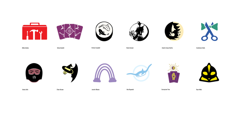
Make your own, imaginary cable or web station.Your station ident will be purely graphical (pictorial), that is, there can be no text in your ident design. Your logo may only have two colors (black is considered a color), but logos with just one color are generally stronger designs. Do not use gradients. Your background must be white. If you wanted to have white in your design, make it an off-white to stand out against the white background. Again, this off-white would be one of your two colors. The idea behind this is that your logo design would have an alpha channel (transparency) and could go over both dark and light video footage as a station ident of BUG.
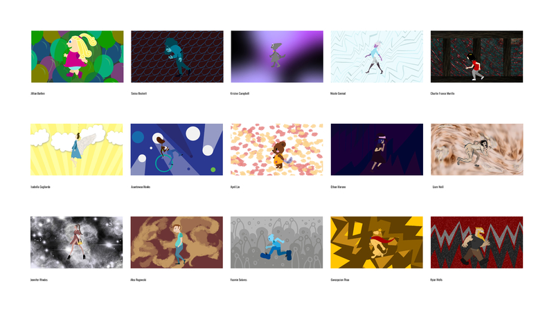
Walk Cycle:
Choose one emotional state, design a 2D puppet character, and use DuIK Bassel to create a manual walk cycle (you may not use the auto-walk) such that the character's staging and appeal depict that emotional state through the remaining 12 Principles of Animation. The character will walk in place with an abstract background behind it, which likewise reflects that character's emotion, and sound effects will help emphasize the movement of the walk. The walk cycle must demonstrate overlapping action and follow through a secondary action, such as the movement of head, hair, tail, ears, clothing, or similar.
